MilliporeSigma Account Page UX Improvements
The MilliporeSigma Account Page is the users' dashboard, giving them access to all of their account and order information. However, there were a number of problems with the existing Account Page. I was tasked with improving the Account Page UX and updating it to the new MilliporeSigma brand.
The first screenshot below shows the original account page. The account icons are vague and unappealing, and in many cases important links such as "Change My Password" are not readily available.
The second screenshot below shows my UX improvements. I used elements of the new MilliporeSigma brand, such as bright colors and rounded shapes, to make the interface more visually appealing. I also surfaced a number of buried links (such as "Change My Password") to make it easier and faster for users to access important account features, and organized the links into four clear categories. Moving "Track My Order" to the main interface helped to de-clutter the left sidebar.
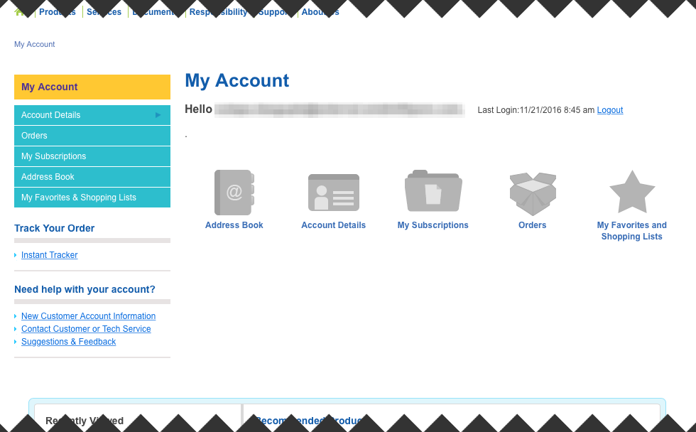
the original Account Page featured vague, unappealing icons that hid important links
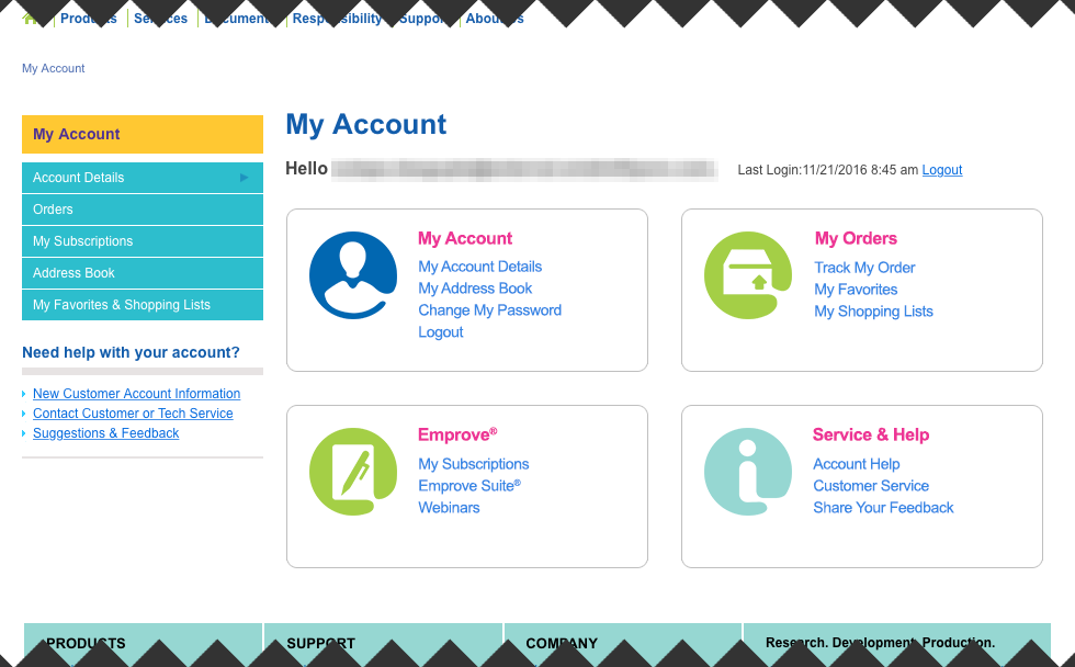
the improved Account Page utilized the bright colors and rounded shapes of the new brand to make the page more appealing, and essential account links were made readily available